Application Design
Redesign Tripsdrill
Tripsdrill is a much-loved theme park in southern Germany, but its website doesn't do it justice: it's clunky and hard to navigate. This project rethinks it from the ground up, structure first, then visuals, with a clear focus on how it actually feels to use rather than just a fresh coat of paint.
Responsibilities
Design Thinking
- Website Audit
- How Might We
UX Design
- Kano Model
- Information Architecture
Video Editing
- Moodboards
- Project Video
... design an efficient, uncomplicated way for visitors to book tickets, and a website with clear information and reviews across every attraction and themed area?
Analysing the Problem
Website Audit
The current site has real problems with structure, navigation and visuals. It's overloaded, the hierarchy is muddled, and buying a ticket, the one thing most people come to do, is confusing and hard to follow. The result is frustration.
That audit set the priorities for everything that followed.
Research & Definition
To develop the concept, we first analysed the existing website alongside comparable offerings in a competitive analysis. We then conducted interviews and surveys with theme park visitors to identify needs, expectations, and pain points. On this basis, we created user profiles representing key user groups.
Using "How Might We" questions, we translated our insights into concrete design opportunities and defined clear project goals.
Research & User Insights
Lara
Job Seeker · 25 · LondonGoals
- Book tickets fast and grab any deals along the way
- Find clear info and reviews for each attraction
- Feel welcome as a young adult, not just families
Pain Points
- Problems booking tickets and accommodation when the site is hard to navigate
- Doesn't feel welcomed as a young adult due to the many family-focused images
- Unclear, confusing information about park rules and safety requirements
Motivations
- Chasing the thrill, roller coasters are her happy place
- Curious about the park's different themed worlds
- Just wants a smooth, stress-free day out
Design Strategy
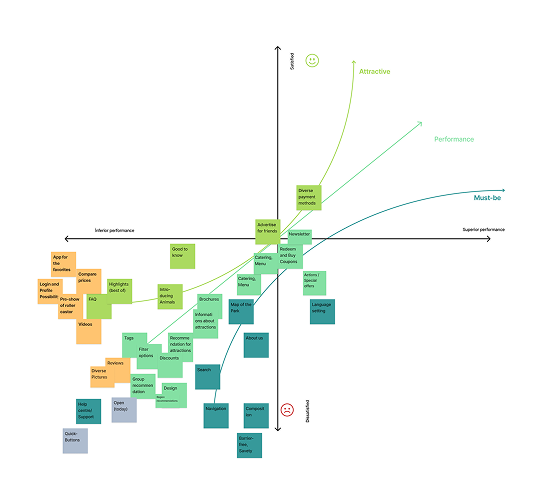
Prioritising with the Kano Model
With the insights in hand, we sorted features using the Kano Model, which splits them into basics people expect, things that simply work better the more you add, and little extras that delight. It kept us focused on what actually mattered.
At the same time, we rebuilt the information architecture and a clearer navigation, so getting around finally feels effortless.
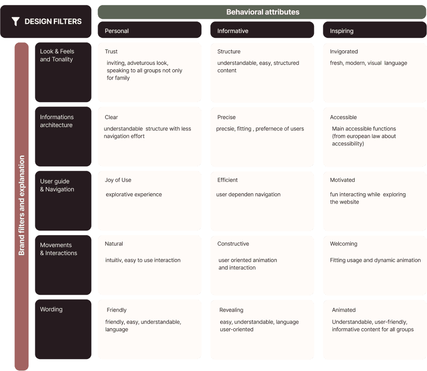
Visual Design Language
For the look, we started with moodboards to explore directions, then used tools like the Brand Design Filter to lock in one consistent visual language. A few rounds of variants later, it settled into a clear styleguide.
Throughout, we kept an eye on three things: that it's recognisable, accessible, and carries the playful character of the park.
The Result
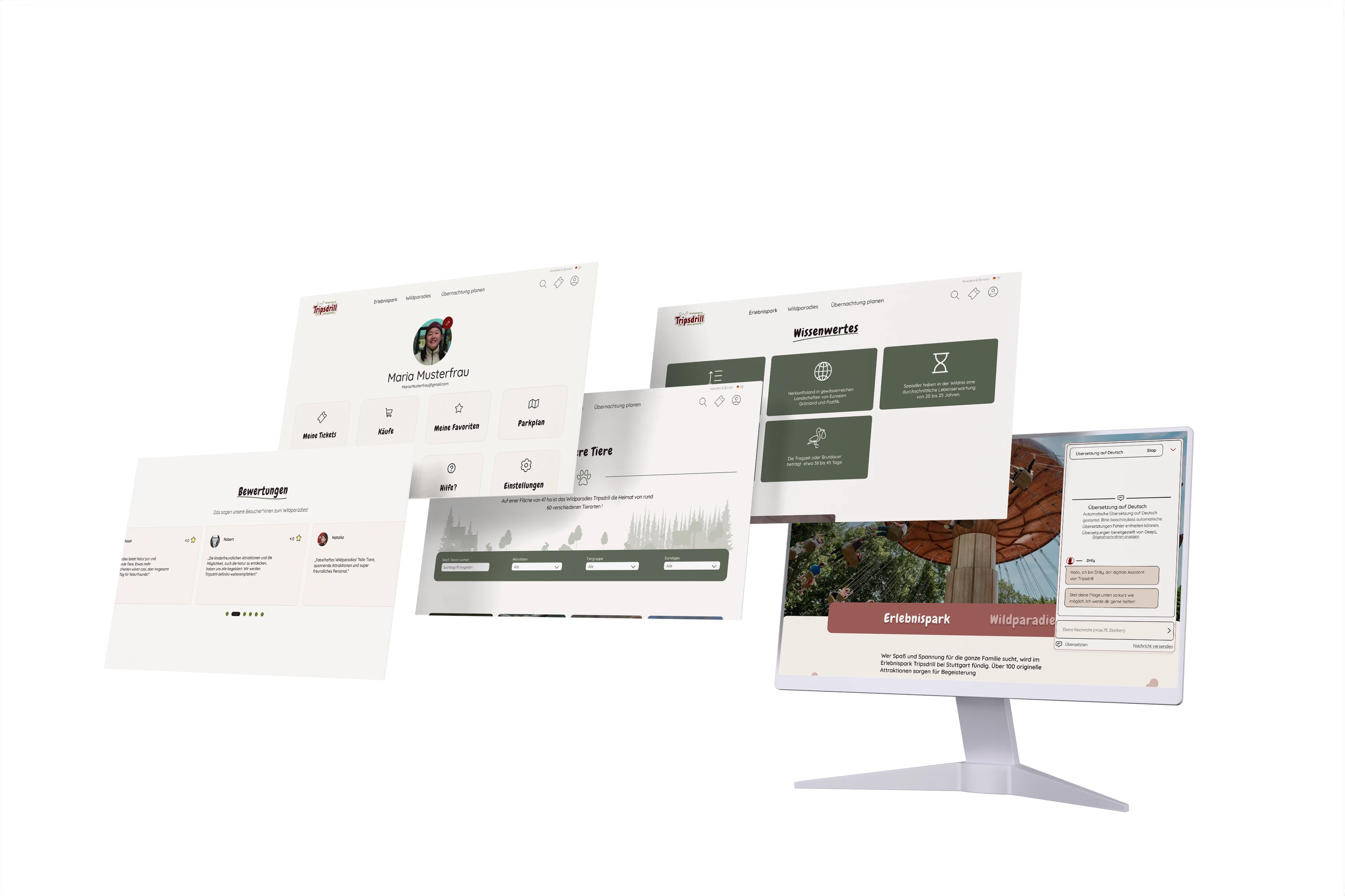
It all came together into a site that's easier to use and finally feels like the park itself: clear to navigate, quick to book, and welcoming to everyone.
Revised Information Architecture
Clearer structure, logical grouping, and intuitive navigation that helps visitors easily explore the two parks, their attractions, and related visitor information.
Simplified Ticket Purchase
A streamlined booking process that reduces friction and gets visitors to checkout faster, with ticket options and accessibility information clearly integrated into the purchase flow.
Integrated Chatbot
An AI-assisted helper that answers common questions and guides users through the site.
Unified Design Language
A refreshed visual identity that modernizes the experience while staying true to the park's unique character and heritage.